Blog
Five Tips for a Great Website Redesign
DynamicWeb
Site navigation is an important and overlooked aspect of e-commerce. You want your customers to know how to find the products and content they’re interested in.
What Is Navigation?
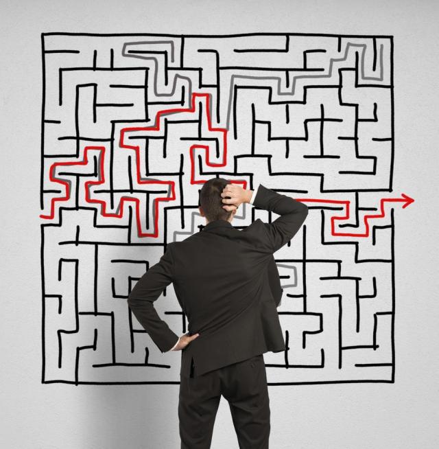
Navigation is how you arrange and show off your site to visitors. Rather than your potential customers getting lost in the labyrinth of your old website, you’d prefer that they be guided along the path towards more discovery and eventual purchase.
Does Better Navigation Mean More Sales?
To new visitors, your website is uncharted territory. Navigation makes it easier for your potential customers to find the information they’re looking for and make a purchase. Making it easy to buy increases your conversion rates. In this report, eConsultancy analyzes research on what gets ecommerce shoppers all the way through to the end of the checkout process. The report also suggests best practices for e-commerce sites, and improving navigation is at the top of their list.
With that in mind, here are Five Tips to improve navigation in your redesigned website.
1. Breadcrumbs
Just as in Hansel and Gretel, digital breadcrumbs leave a trail show your website visitor the path they’ve traveled. For instance, on Dynamicweb’s own website for our Online Marketing, we leave a breadcrumb trail at the top that shows Home / Products / Online Marketing. In this example, the Online Marketing Center is shown as being a part of the larger Products category. And the Products category is part of the main website (which is accessed by going “Home”). This breakdown of where everything lies in your website is called the site hierarchy. An understandable and coherent site hierarchy helps your visitors know where they’re going and where they’ve been. Adding breadcrumbs to your website redesign provides an instant link that visitors can click to quickly jump back to a previous category.
2. Web Design Standards
Websites, specifically ecommerce, share design standards that customers have come to expect. Even with your own website redesign, it’s best not to try to reinvent the wheel. Visitors will expect to see menu bars horizontally at the top of the screen or vertically on the left side of the screen. Shopping cart and checkout options usually appear in the top right with a picture of a literal shopping cart. Research from the Nielsen Norman Group reports that, because people read left to right, the first thing your visitors will do is quickly scan down the left side of your site, looking for lists and navigation menus. The report also discourages any right-aligned menus. Any aesthetic value those menus might have is counteracted by a decrease in usability for your visitors.
3. Limit Clicks
Many web designers use a “Three Click Rule,” which dictates that a visitor should be able to reach the information they’re looking for in three clicks. If you want to truly simplify the browsing process for your new site, this means that each page or category on your website should be reachable in three clicks or less.
4. Limit Confusion
While your website’s different buttons and menus options help your visitor, it is possible to have too much of a good thing. A long menu with every page on your site overwhelms visitors. To correct this, if you remove some of the menu options, the remaining options visually stick out more. Instead of inundating your potential customers, try grouping your site into categories in the navigation menu. Within those categories, include five to seven sub-categories or content pages about the main category. For an example, consider the Online Marketing page on Dynamicweb’s own website. Online Marketing is a sub-category of the Products page, which itself is a category within the main site. This is a clearly delineated site hierarchy, and a visitor only takes three clicks to get there!
5. Support SEO
Good site navigation also supports Search Engine Optimization (SEO). You want to be easy to find when people go searching for specific products and industries on sites like Google or Bing. If you want your page to come up when people are using search, make sure that the navigation labels in your website redesign contain keywords that repeat throughout the page. By cleaning up your site with categories and sub-categories as discussed, each link also becomes more relevant. A specific “Online Marketing” sub-category, for example, is very relevant to those searching for that term. This relevance is something that Google measures when ranking websites for their search engines! So not only does good navigation give you the benefit of a better user experience, but you also get seen by more people.
Speaking of Search…
Many people arrive at a website through organic search, so it’s very possible that some visitors may never even see your Home page. If someone arrives on one of your sub-category pages through search, your navigation is even more important. Breadcrumbs allow the new visitor to jump back up to different category headings, and a well-organized menu structure makes moving around the site easier. And by making navigation easier with a website redesign, you increase the likelihood that visitors who come looking for what you offer will stick around to check out your content and products.
We’re also here to help with any other questions or needs — email our team at info@dynamicweb.com.